Let’s go over a few telltale signs that can let you know whether or not your WordPress site is in need of a makeover.
1. Your Website is Not Mobile Friendly

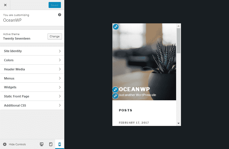
Over 60% of all Google searches come from mobile devices, as Google first stated in 2015. This means the likelihood of a visitor viewing your website on a mobile device is higher than ever. This also means your site needs to be responsive and otherwise mobile friendly. It’s no longer a question.
The easiest way to make your website responsive and mobile friendly is by updating to a new theme that comes with these features built in. The WooVina theme and all of its demos are responsive and ready for the mobile web. You can install each one with a single click using our free demo import extension.
The hardest way would be to insert code for this into your current theme or have a web developer do it for you.
2. Your Domain Ranks Low in Google
Google wants the best of the best in its top pages. It weeds out low-quality websites with every new algorithm it releases. If your website ranks low in Google, you may have one of those low-quality websites.
There are dozens upon dozens of factors that go into Google’s ranking system, but these are the highlights in terms of web design:
- Quality Content
- Original Content
- Mobile-Friendly Website
- Fast Page Load Times
If you’re still publishing small blog posts of under 500 words each or are syndicating/scraping content from other websites, you likely won’t rank well in Google. You need original, in-depth content that covers topics thoroughly.
3. You Have Broken Links & Outdated Pages
Links that lead to pages that no longer exist and pages you no longer use have no place in your website’s structure. It makes the back and frontend of your site a mess.
Use a plugin like Broken Link Checker to find broken links on your site, and remove those links or redirect them to a page that functions correctly. Afterward, set up a Google Search Console account for your site to monitor broken links and receive alerts when they occur.
Lastly, go through the list of pages you created inside of WordPress, and remove the ones you no longer use.
4. You Still Use a Hit Counter
Ah, hit counters. Letting visitors know how many other people visited your site used to be the bee’s knees in 1999, but it has no place on a modern business website or blog. Use a theme and homepage that highlight your services and content with well-designed elements, and leave the gimmicky web designs behind.
5. You Use a Sidebar on the Homepage (Business Websites Only)
This isn’t much of an issue with blogs, but it when it comes to the homepage of a business website, it needs to be clean and have a clear focus.
This is more commonly referred to as a “call to action.” Your homepage should be optimized for conversions, which means it should get a potential customer to buy or contact you for a consultation. If you clutter it with a sidebar filled with links to your social media accounts, latest and greatest posts, and more you’re driving attention away from that call to action.
6. You Use Outdated Web Design Styles
Web design has gone through many changes since the first website went live in 1991, and unfortunately, some of the more outdated styles still plague much of the web today.
7. Colors

The first style I’ll mention are colors. Using the main shades of colors used to be the way to go, as you can see in the logo Google used in 1998. You can see how harsh and outdated these colors look.
Unfortunately, the use of such shades haven’t been completely obliterated in the last 20 years. Many websites still use harsh shades of blue, red and green, shades that do nothing more than harm the eyes and make your website look cheap.
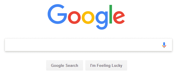
Instead, you should use different shades of each color to give the design a flatter appearance. You can see how well this worked for Google in the new logo they unveiled in late 2015.

All of the colors are lighter, and the entire design is flat. This gives it a much sharper appearance that maintains its sharpness no matter how much it’s resized.
Use a service like Colors to generate better color schemes for your business.
8. Fonts
This point piggybacks off of the use of Google’s logo in the last point. Fonts fall into two main categories:
- Serif
- Sans-Serif
Serif fonts have been the standard in print for centuries while sans-serif fonts are known for their web friendliness due to their rounded edges, though there are plenty of serif fonts that have been redesigned for the web.
If you don’t know the difference between these two types of fonts, look at the appearance of the font used in the Google logo we referenced. Google’s old logo was a serif font, and their new logo is a sans-serif font. They changed their font to ensure it looks nice and legible no matter the size of the screen you’re viewing it on.
You should consider changing your fonts as well to ensure…
- Your text is legible on mobile devices.
- Your site doesn’t look outdated by using fonts that have gone out of style.
A simple way to ensure your fonts aren’t outdated is by sourcing them from Google Fonts. This is a library filled with fonts that have been revamped for the modern web.
9. Wrapping Up
Keeping up with the times can be difficult, especially when a new trend is announced everyday. It can be difficult to predict whether a trend will change the way we design or die off just as quick as it was born, especially if you’re not familiar with web design.
This list contained a few main elements you need to be concerned about, so we hope it simplified things enough for you to take action and give your WordPress site a complete makeover.

